테스트 11. 텍스트 꾸미기
- text-align : 문자의 정렬 방식
- text-decoration : 문자에 주는 효과. 취소선, 밑줄 등. 혹은 링크의 밑줄을 지우는 것도 가능하다.
- text-indent : 들여쓰기 방식
<!DOCTYPE html>
<html>
<head>
<meta charset="UTF-8">
<title>텍스트 꾸미기</title>
<style>
h3 {
	text-align: right;
}

span {
	text-decoration: line-through;
}

strong {
	text-decoration: overline;
}

.p1 {
	text-indent: 3em;
	text-align: justify;
}

.p2 {
	text-indent: 1em;
	text-align: center;
}
</style>
</head>
<body>
	<h3>텍스트 꾸미기</h3>
	<hr>
	<p class="p1">
		HTML의 태그만으로 기존의 워드프로세서와 같이 들여쓰기, 정렬, 공백, 간격 등과 세밀한 <span>텍스트 제어</span>를
		할 수 없다.
	</p>
	<p class="p2">
		그러나, <strong>스타일 시트</strong>는 이를 가능하게 한다. 들여쓰기, 정렬에 대해서 알아본다.
	</p>
	<p>
		<a href="http://www.naver.com" style="text-decoration: none">밑줄이
			없는 네이버 링크</a>
</body>
</html>
테스트 12. CSS 폰트
- font-family : 폰트 모음의 이름
- serif : 바탕체
- sans-serif : 고딕체
- font-size : 폰트의 크기
- large : 기본 저장된 큰 글씨에 해당하는 크기
- 1.5em : 원래 크기의 1.5배
- 그 외 px 등의 단위로도 크기 지정 가능
- font : 그냥 폰트에 미리 지정된 양식을 바로 대입할 수 있다. italic, bold 등
- font-weight : 폰트 두께
- font-style : 이탤릭, 볼드체 등의 다양한 스타일
<!DOCTYPE html>
<html>
<head>
<meta charset="UTF-8">
<title>폰트</title>
<style>
body {
	font-family: "Times New Roman", Serif;
	font-size: large;
}

h3 {
	font: italic bold 40px consolas, sans-serif;
}
</style>
</head>
<body>
	<h3>Consolas font</h3>
	<hr>
	<p style="font-weight: 900">font-weight 900</p>
	<p style="font-weight: 100">font-weight 100</p>
	<p style="font-style: italic">Italic Style</p>
	<p style="font-style: oblique">Oblique Style</p>
	<p>
		현재 크기의 <span style="font-size: 1.5em">1.5배</span> 크기로
	</p>
</body>
</html>
테스트 13. <div>의 박스 모델 보이기
- div로 분할 된 박스에 다양한 스타일을 적용할 수 있다.
<!DOCTYPE html>
<html>
<head>
<meta charset="UTF-8">
<title>박스 모델</title>
<style>
body { background: ghostwhite; }
span { background: deepskyblue; }
div.box {
	background: yellow;
	border-style: solid;
	border-color: peru;

	margin: 40px;
	border-width: 30px;
	padding: 20px;
}
</style>
</head>
<body>
	<div class="box">
		<span>DIVDIVDIV</span>
	</div>
</body>
</html>
테스트 14. 박스 모델 활용
- 박스 모델의 응용
<!DOCTYPE html>
<html>
<head>
<meta charset="UTF-8">
<title>박스 모델</title>
<style>
div.inner {
	background: yellow;
	padding: 20px;
	border: 5px dotted red;
	margin: 30px;
}
</style>
</head>
<body>
	<h3>박스 모델</h3>
	<p>margin 30px; padding 20px; border 5px의 빨간색 점선</p>
	<hr>
	<div class="inner">
		<img alt="고양이눈" src="media/mio.png">
	</div>
</body>
</html>

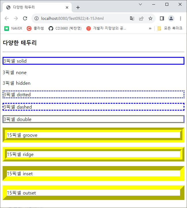
테스트 15. 다양한 테두리 선 스타일
- 다양한 테두리 꾸미기 요소
<!DOCTYPE html>
<html>
<head>
<meta charset="UTF-8">
<title>다양한 테두리</title>
</head>
<body>
	<h3>다양한 테두리</h3>
	<hr>
	<p style="border: 3px solid blue"> 3픽셀 solid</p>
	<p style="border: 3px none blue"> 3픽셀 none</p>
	<p style="border: 3px hidden blue"> 3픽셀 hidden</p>
	<p style="border: 3px dotted blue"> 3픽셀 dotted</p>
	<p style="border: 3px dashed blue"> 3픽셀 dashed</p>
	<p style="border: 3px double blue"> 3픽셀 double</p>
	<p style="border: 15px groove yellow"> 15픽셀 groove</p>
	<p style="border: 15px ridge yellow"> 15픽셀 ridge</p>
	<p style="border: 15px inset yellow"> 15픽셀 inset</p>
	<p style="border: 15px outset yellow"> 15픽셀 outset</p>
</body>
</html>
테스트 16. 다양한 둥근 모서리 테두리
- 둥근 모서리는 border-radius로 만들 수 있다. 둥근 정도는 반지름의 크기로 구분한다.
- 반지름을 4번 지정한 경우 시계방향으로 적용한다.
- 반지름을 3번 지정한 경우 좌상단, 우상단/좌하단, 우하단으로 적용한다.
- 반지름을 2번 지정한 경우 좌상단/우하단, 좌하단, 우상단으로 적용한다.
<!DOCTYPE html>
<html>
<head>
<meta charset="UTF-8">
<title>둥근 모서리 테두리</title>
<style>
p {
	background: #90D000;
	padding: 20px;
	width: 300px;
}
#round1 {border-radius: 50px;}
#round2 {border-radius: 0px 20px 40px 60px;}
#round3 {border-radius: 0px 20px 40px;}
#round4 {border-radius: 0px 20px;}
#round5 {border-radius: 50px;
	border-style: dotted;}
</style>
</head>
<body>
	<h3>둥근 모서리 테두리</h3>
	<hr>
	<p id="round1">반지름 50픽셀의 둥근 모서리</p>
	<p id="round2">반지름 0, 20, 40, 60 둥근 모서리</p>
	<p id="round3">반지름 0, 20, 40 둥근 모서리</p>
	<p id="round4">반지름 0, 20 둥근 모서리</p>
	<p id="round5">반지름 50의 둥근 점선 모서리</p>
</body>
</html>

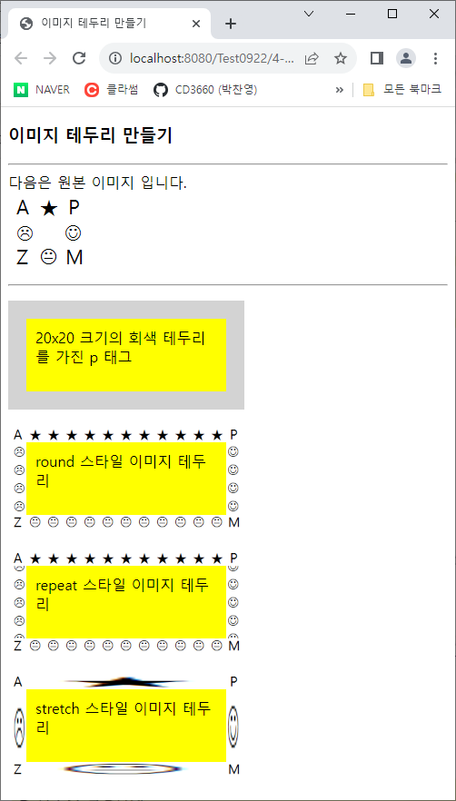
테스트 17. 이미지 테두리 만들기
- 테두리 이미지를 만들어 적용할 수 있다.
- round는 이미지가 짤리지 않고 반복된다.
- repeat은 이미지가 짤릴 수 있고 반복된다.
- stretch는 각 구간의 이미지를 늘여서 적용한다.
<!DOCTYPE html>
<html>
<head>
<meta charset="UTF-8">
<title>이미지 테두리 만들기</title>
<style>
p {
	background: yellow;
	width: 200px;
	height: 60px;
	padding: 10px;
	border: 20px solid lightgray;
}
#round {border-image: url("media/border.png") 30 round;}
#repeat {border-image: url("media/border.png") 30 repeat;}
#stretch {border-image: url("media/border.png") 30 stretch;}
</style>
</head>
<body>
	<h3>이미지 테두리 만들기</h3>
	<hr>
	다음은 원본 이미지 입니다.<br>
	<img alt="원본" src="media/border.png">
	<hr>
	<p>20x20 크기의 회색 테두리를 가진 p 태그</p>
	<p id="round">round 스타일 이미지 테두리</p>
	<p id="repeat">repeat 스타일 이미지 테두리</p>
	<p id="stretch">stretch 스타일 이미지 테두리</p>
</body>
</html>
테스트 19. text-shadow 프로퍼티로 텍스트 그림자 만들기
- text-shadow를 이용해 다양한 스타일의 그림자를 만들 수 있다
- 크기를 여러 개 지정할 수 있다.
- 2개 지정 시 우측, 하단으로 이동할 거리를 지정한다.
- 3개 지정 시 우측 하단 이동 거리 후 마지막은 블러 효과 범위를 나타낸다.
<!DOCTYPE html>
<html>
<head>
<meta charset="UTF-8">
<title>텍스트 그림자</title>
<style>
div {
	font: normal 24px verdana;
}
.dropText {
	text-shadow: 3px 3px;
}
.redText {
	text-shadow: 3px 3px red;
}
.blurText {
	text-shadow: 3px 3px 5px skyblue;
}
.glowEffect {
	text-shadow: 0px 0px 3px red;
}
.wordArtEffect {
	color: white;
	text-shadow: 0px 0px 3px darkblue;
}
.threeDEffect {
	color: white;
	text-shadow: 2px 2px 4px black;
}
.multiEffect {
	color: yellow;
	text-shadow: 2px 2px 2px black,
				0 0 25px blue,
				0 0 5px darkblue;
}
</style>
</head>
<body>
	<h3>텍스트 그림자 만들기</h3>
	<hr>
	<div class="dropText">Drop Shadow</div>
	<div class="redText">Color Shadow</div>
	<div class="blurText">Blur Shadow</div>
	<div class="glowEffect">Glow Effect</div>
	<div class="wordArtEffect">WordArt Effect</div>
	<div class="threeDEffect">3D Effect</div>
	<div class="multiEffect">multiple Shadow Effect</div>
</body>
</html>

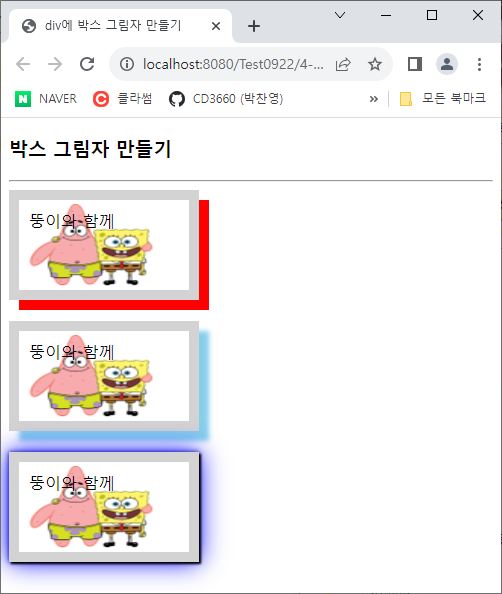
테스트 20. box-shadow 프로퍼티로 박스 그림자 만들기
- box-shadow를 이용해 다양한 스타일의 그림자를 만들 수 있다
- text-shadow와 같은 양식으로 작성할 수 있다.
<!DOCTYPE html>
<html>
<head>
<meta charset="UTF-8">
<title>div에 박스 그림자 만들기</title>
<style>
.redBox {
	box-shadow: 10px 10px red;
}
.blurBox {
	box-shadow: 10px 10px 5px skyblue;
}
.multiEffect {
	box-shadow: 2px 2px 2px black,
				0 0 25px blue,
				0 0 5px darkblue;
}
div {
	width: 150px;
	height: 70px;
	padding: 10px;
	border: 10px solid lightgray;
	background-image: url("media/spongebob.png");
	background-size: 150px 100px;
	background-repeat: no-repeat;
}
</style>
</head>
<body>
	<h3>박스 그림자 만들기</h3>
	<hr>
	<div class="redBox">뚱이와 함께</div><br>
	<div class="blurBox">뚱이와 함께</div><br>
	<div class="multiEffect">뚱이와 함께</div>
</body>
</html>
'공부일지' 카테고리의 다른 글
| 230925 HTML (0) | 2023.09.25 |
|---|---|
| 230922 (Java) (0) | 2023.09.22 |
| 230921 (Java) (0) | 2023.09.21 |
| 230921 (HTML) (0) | 2023.09.21 |
| 230920 (Java) (0) | 2023.09.20 |


